By Christopher Collier, guest writer of the MAS
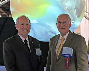
SOS inventor Dr. MacDonald (Left); Former Director, National Hurricane Center, Dr. Max Mayfield (Right)
Science On a Sphere® was first conceptualized and prototyped by Dr. Alexander MacDonald in 1995. Then the Director of National Oceanic and Atmospheric Administration’s (NOAA) Forecast Systems Laboratory, MacDonald developed SOS as an extension of other visualization projects that he was directing at the time. As the project progressed and expanded, so did its potential and purpose. The project was initially developed and designed for environmental data exploration, but its greatest purpose was discovered in the realm of education. It became clear that, if coupled with supporting educational material, the sphere would greatly impact the way we learn about the Earth as a system.
Science On a Sphere® saw its first permanent installation in 2004, nine years after the project’s inception. The final product was a room-sized, global display system that used computers and video projectors to display planetary data onto a six-foot diameter sphere, akin to a large animated globe. Today, 16 years after its initial launch, there are over 150 SOS installations in science centers, universities, and museums around the globe
Science On a Sphere® is equipped with over 500 data sets and can display images of atmospheric storms, climate change, ocean temperature, hurricanes, earthquakes, pandemics, and more. With SOS, NOAA aims to increase public understanding of complex environmental processes. According to Hilary Peddicord, education specialist for SOS at NOAA, its mission has been a success.
“Maps and global animations are a great way to make sense of Earth data albeit often quite complex,” Peddicord said. “You can spend half an hour looking at one dataset that shows a climate scenario eighty years into the future and discuss all the possible elements that would go into a projection of what the future looks like. That's why we have known for a long time that careful facilitation and informal education techniques are typically the key to making non-narrated data visualization on SOS most effective.”
NOAA’s expansive mission found its way to Macon, Georgia when the Museum of Arts and Sciences added Science on a Sphere® as a permanent exhibit on Sept. 1, 2015. Funded by The Peyton Anderson Foundation, the SOS installation is one of 87 in the United States and the first and only in Georgia. 3,796 students and adults have experienced formal educational programs through Science on a Sphere® at the MAS since Jan. 1, 2018. Susan Mays, MAS Director of Programs, has used SOS to meet the educational needs of Georgia students.
“We have done school programming in three primary areas: weather, tectonics (volcanoes and earthquakes), and space (looking at the planets and moons in our solar system),” Mays said. “These programs are specifically designed to be interactive and to meet the Georgia Standards of Excellence at several grade levels and are sometimes combined with hands-on programming.”
Mays said that the Sphere’s visual configuration allows students to comprehend complex world events and view the Earth as an interconnected system.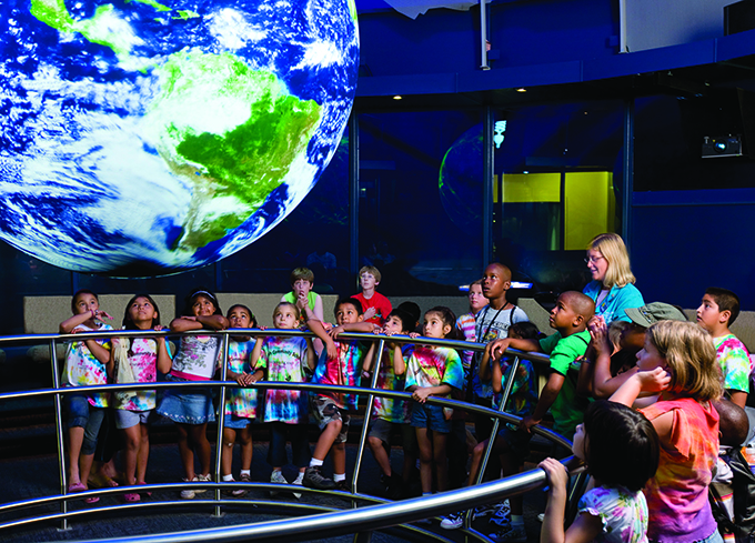
“You hear about the earthquake in Japan [but] this gives you an opportunity to show that the earthquake in Japan affected a lot of people besides Japan in one way or another,” Mays said. “And then if you take weather as an example, a program that you can do—you can look at everything about weather from precipitation to temperature change to seasonal variations [to] hurricanes. We can go back and show the development of [Hurricane] Katrina in a very clear and precise way. You can see how that hurricane developed off the coast of Africa and came up through the Caribbean. You can see the time, and you’ve got a timestamp as you’re showing this video, you can see the point at which the eye [of the hurricane] became so clearly defined that you can see it on the satellite view.”
Mays hopes to target and improve the sphere’s accessibility in the future with the addition of a public kiosk that allows museum guests to select and view various data sets on their own. She also seeks the creation of a program that would allow high school students to use SOS as a teaching tool for class presentations.
Paul Fisher, MAS Science Curator, said that the sphere makes for a great teaching tool.
“[SOS] blends really well with the planetarium shows because one thing they (NOAA) have is a lot of planet maps and satellite maps,” Fisher said. “They’ve got Jupiter, Saturn, Uranus, Neptune, Pluto, Mercury, [and] they have Venus. Then they have all the moons of each of those—the major moons. So often in my planetarium shows—in the Mark Smith Planetarium, you can actually fly out into space and fly to Jupiter and orbit Jupiter’s moons. And then people often come out of there, and if I have the space collection running on SOS, they can come out and see some of those moons more clearly.”
The world continues to wade through the digital, socially-distant year that is 2020, and NOAA is focused on both adapting to and explaining COVID-19. Peddicord said NOAA has shifted its focus to SOS Explorer, a free mobile app that allows users to experience more than 100 datasets from afar. In addition, Peddicord said that NOAA is developing data sets that will visualize the spread of the pandemic and detail the environmental impact of stay-at-home orders. As with all data sets, NOAA’s mission remains the same: explain the complexity of the Earth, one animated sphere at a time.